Most folks who care about typefaces hate the font known as Comic Sans. Back in the early days of computers, that was someone's idea of what lettering in comic books looks like…but no professional comic book company would hire a letterer who lettered like that. Some of us cringe when we see it, especially in a context that's supposed to represent comics. Recently, a gent named Craig Rozynski designed a variant which he calls Comic Neue and which he has released into the public domain. You can download it here and install it on your computer. I wish I could say I like it more than I do.
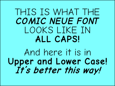
It's especially lacking to me when it's used for ALL CAPS, which is how almost all comic book and strip lettering is done and it's the way Comic Sans has usually been used. The "C" and the "O" look rather anemic to me and, as with Comic Sans, we still have those ugly serifs on a capital "I." Professional comic book fonts always give you the option of a serifed "I" when you type the letter as a standalone and a non-serifed "I" when you're in the middle of a word. I also think the slanted crossbar on the "A" and "H" don't go with the non-slanted look of other letters.
I like it better for upper-and-lower case lettering because that eliminates much of the serif problem with the "I" but the interline spacing gets a bit dicey. I tried leaving more space between the lines but it seemed erratic. I appreciate Mr. Rozynski's generous efforts and he did improve on Comic Sans. But I think it still looks like lettering done by someone who isn't a professional cartoonist.