While I was digging out those panels from The Wiz comic book to scan the other day, I found a mis-filed file folder in my filing cabinet. It was full of rough sketches I did in the early seventies for covers of Gold Key comic books I was writing. I did mine tighter and more like finished art than the other folks who were designing these, even though I had no thought that they might ever ask me to draw the final covers…and indeed, they did not. Here are two examples with my pencil rough on the left and the finished comic on the right.
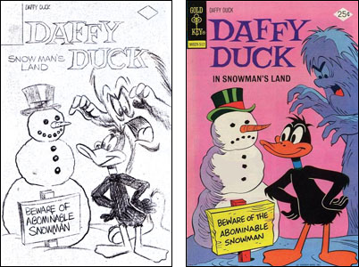
On the Daffy Duck one, I committed what was then considered a mortal sin: I merged Daffy's eyes together. This was the early seventies and there was no active Warner Brothers Cartoon Department. The folks who decided what those characters looked like — whether they were drawn properly — were in some sort of Licensing Division at the Warner company and they were furious if Daffy's eyes merged. There had to be black between them.
Fortunately, they never saw my rough or I might have been forbidden to ever draw (or even imagine) Daffy ever again. They didn't approve roughs; just the finished art which in this case was done by Joe Messerli.
My editor there, Chase Craig, told me horror stories of having to deal with those folks. Many of the artists he employed were former Warner Brothers animators. Tom McKimson was drawing the Bugs Bunny comic books I and others were writing. Phil DeLara was drawing Porky Pig or sometimes, it was Pete Alvarado. These were all guys who didn't take well to having someone tell them they were getting the characters wrong. At one point, someone at Warner's reportedly complained that Tom McKimson's Bugs didn't look right and they sent over some Xeroxes of old drawings that they wanted him to study to see the proper way to draw the wabbit. Tom replied, "Tell those idiots that I did those old drawings!"
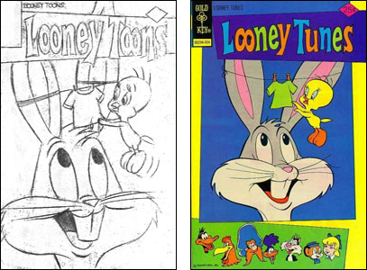
At one point, Chase informed me the company had decided to revive the old Looney Tunes comic book, though they wanted to retitle it Looney Toons. Warner okayed the new title, then changed their minds at the last minute, forcing it to be pulled off the presses so it could be changed to Looney Tunes. Something about trademarks.
I wrote the first issue and worked up the cover sketch. Before I did, I asked Chase who was going to design the title logo for the new book. He said — with some annoyance because there had apparently been problems over this recently — that his company had recently hired an "overpaid graphics designer" (that was the term he used) to do all their logos. He thought this person, who worked for their New York office, was not very good.
Chase had been fighting to get them to not redesign a lot of the logos on his books that he thought were in no need of improvement. He told me, "It doesn't matter what you do. This fellow will come up with something we'll all dislike." So when I did my cover rough, I didn't even try to suggest a logo idea. I just wrote "Looney Toons" on it in block letters without much thought.
Chase okayed the sketch but decided to add other characters' heads onto the cover so he had the final artists do a little rearranging. (I believe the final art was penciled by Pete Alvarado and I think that was Larry Mayer's inking.) My rough and Chase's amended rough accompanied the finished art when it was sent back to New York…
…where the "Overpaid Graphics Designer" followed what I'd penciled in. If I'd known he was going to do that, I would have tried to come up with an actual idea. And that, folks, is how creative decisions have often been made in the comic book industry.